The kitchen is often considered the heart of the home, but in modern interior design, it is also the primary indicator of a property’s value and aesthetic sophistication. While monochromatic kitchens have long been the standard for “safe” design, the two-tone cabinetry trend has emerged as the definitive way to inject personality, depth, and a sense of high-end custom craftsmanship into the space. By strategically layering colors and textures, homeowners can manipulate the visual proportions of the room, making small kitchens feel airier and large kitchens feel more grounded.
Transitioning to a two-tone palette is more than just a stylistic choice; it is an architectural tool. It allows you to highlight specific zones, such as a statement island or a coffee station, while maintaining a cohesive flow. When executed correctly, this design strategy mimics the look of a bespoke, designer-commissioned kitchen that costs tens of thousands more than its retail counterparts. Here are eight two-tone kitchen cabinet ideas that will instantly elevate your home to a level of expensive, timeless luxury.
1. Navy & White

The combination of navy blue and white is a masterclass in high-contrast elegance. Often referred to as “the new neutral,” navy blue provides a grounding effect that feels regal and substantial. By placing the darker navy on the base cabinets and keeping the upper cabinets a brilliant white, you prevent the room from feeling top-heavy or enclosed.
This specific pairing works exceptionally well in kitchens with high ceilings. The white uppers blend into the wall, drawing the eye upward and creating an illusion of infinite space, while the navy lowers act as an anchor. To truly maximize the “expensive” look, pair this duo with brass or gold hardware. The warmth of the metal cuts through the coolness of the blue, creating a nautical yet sophisticated “Hamptons-style” aesthetic that never goes out of fashion.
2. Sage & Oak
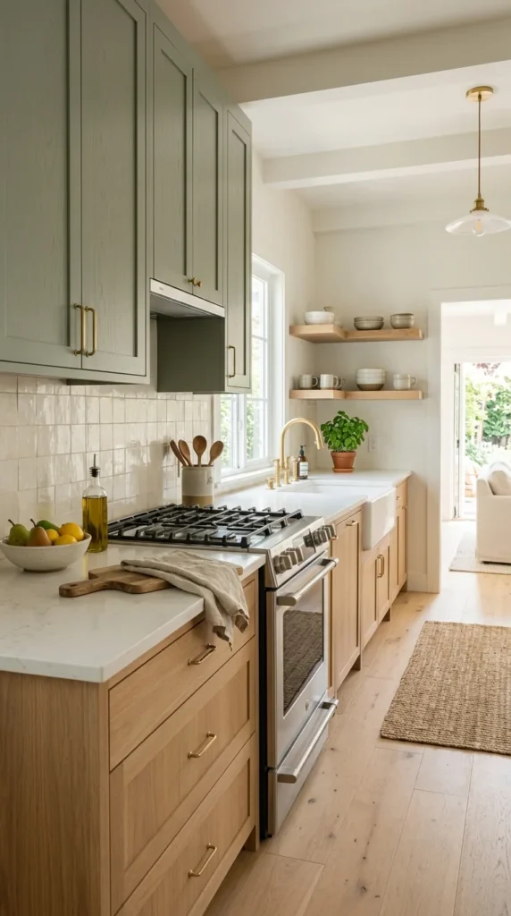
Organic luxury is a rising trend in high-end real estate, focusing on bringing the textures of nature indoors. Sage green, with its earthy undertones, pairs beautifully with the visible grain of natural oak. This combination moves away from the sterile feel of all-white kitchens and embraces a “modern farmhouse” or “English cottage” vibe that feels curated and expensive.
The key to making this look work is the texture. The matte finish of the sage paint contrasted against the tactile, organic feel of the wood grain creates a multi-dimensional look. Designers often recommend using the wood for the lower cabinets or the kitchen island to provide a sturdy, furniture-like feel, while the sage green uppers add a soft pop of color that feels calming and refreshed.
3. Black & Walnut
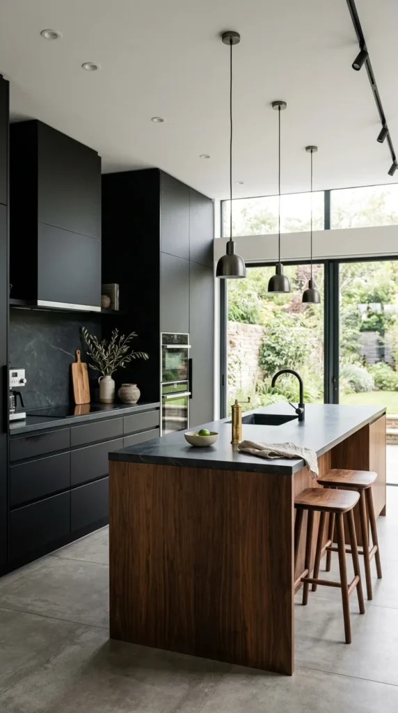
If you are aiming for a masculine, ultra-modern, or industrial-chic aesthetic, black and walnut is the ultimate power couple. This pairing screams luxury because it relies on the quality of materials rather than bright colors to make a statement. Matte black cabinets provide a “disappearing” effect that hides clutter and emphasizes the kitchen’s silhouette.
Walnut is one of the most expensive-looking wood species due to its rich, dark heartwood and complex grain patterns. When used as a secondary tone—either on the island or as a block of tall pantry cabinets—it adds an immediate sense of warmth and “old world” craftsmanship to a modern space. This look is best complemented by integrated appliances and minimalist, handle-less cabinetry to maintain a streamlined, high-end appearance.
4. Charcoal & Dove
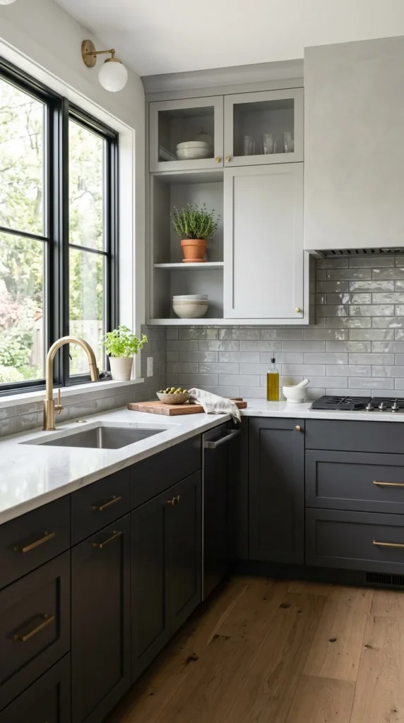
For those who prefer a monochromatic look but want more depth than a single color can provide, a tonal gray approach is the perfect solution. Using charcoal gray for the lowers and a pale dove gray for the uppers creates a sophisticated gradient that feels incredibly intentional.
This “tonal” approach is frequently seen in high-end European kitchen showrooms. It is less jarring than a black-and-white contrast but offers more visual interest than a standard gray kitchen. To keep this look from feeling cold, it is essential to layer in different finishes. For example, use a matte finish for the dark cabinets and a high-gloss or satin finish for the lighter ones to reflect light around the room.
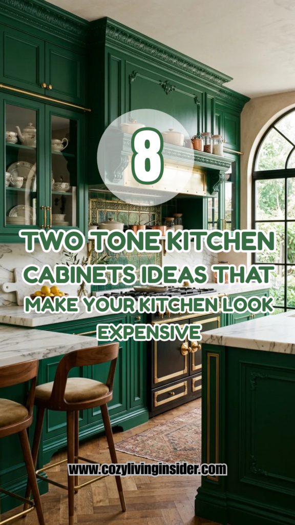
5. Emerald & Brass
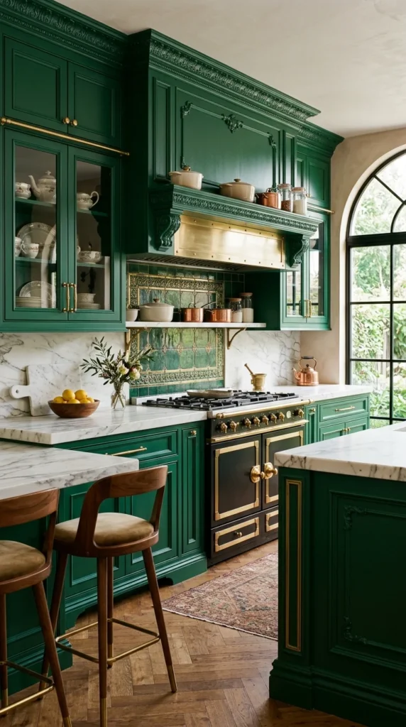
Jewel tones are a hallmark of bespoke luxury. Emerald green, in particular, evokes a sense of history, wealth, and drama. When used in a kitchen, it transforms the space into a destination rather than just a utility room. To keep emerald from becoming overwhelming, it is often paired with a neutral upper—usually a creamy off-white or even a mirrored cabinet face.
The “expensive” factor here is heavily dependent on the hardware. Emerald green requires the yellow tones of brass or copper to truly sing. This combination mimics the look of high-end furniture and works beautifully in homes with traditional architectural details like crown molding or herringbone floors. It is a bold choice that signals a confident, designer-led vision.
6. Cream & Espresso
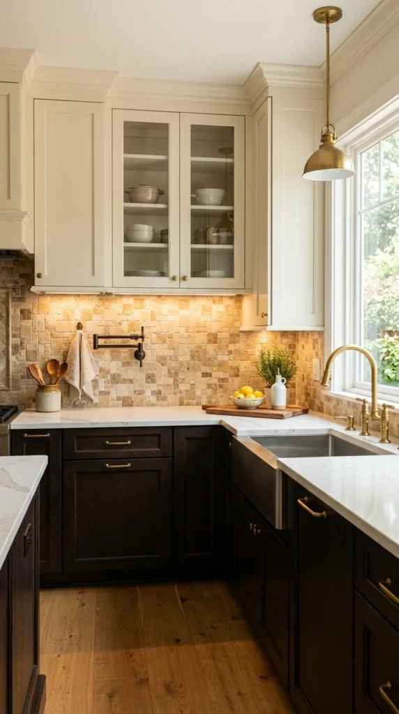
In the world of luxury design, “warmth” is often equated with “comfort.” While stark whites can sometimes feel clinical, a creamy off-white paired with a deep espresso brown creates a “coffee-and-cream” palette that feels expensive and inviting. This is a classic “Transitional” design choice, blending the lines between traditional and contemporary.
The espresso tone should be so dark it almost looks black, providing a sharp contrast to the rich, buttery cream. This look is particularly effective in kitchens with plenty of natural light, as it prevents the dark lowers from feeling too heavy. Pairing this with a warm-toned stone, like Travertine or a gold-veined marble, reinforces the high-end, classic feel of the space.
7. Greige & Matte Black
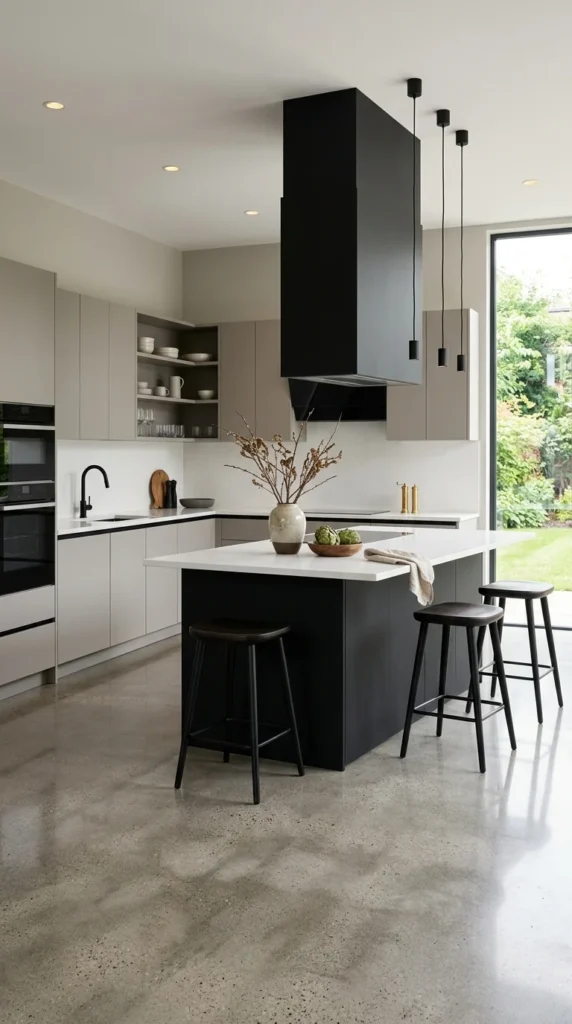
Greige has become the gold standard for luxury neutrals because it offers the coolness of gray with the warmth of beige, making it incredibly versatile under different lighting conditions. When you pair sophisticated greige cabinetry with matte black accents—such as a black island, black hardware, or a black range hood—the result is an architectural masterpiece.
The matte black acts as a “frame” for the greige, highlighting the clean lines of the cabinetry. This look is frequently utilized in high-end lofts and modern penthouses where a minimalist but impactful aesthetic is desired. It feels “expensive” because it is understated; it doesn’t shout for attention but relies on a perfectly balanced palette to impress.
8. Teal & Ash
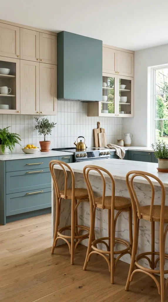
For a kitchen that feels fresh, artistic, and expensive in a “Scandinavian-cool” way, teal and ash is an inspired choice. A muted, dusty teal offers a unique pop of color that is still sophisticated enough for a high-end home. When paired with ash wood—which is known for its pale, almost white appearance and straight grain—the kitchen feels light, airy, and incredibly modern.
This combination works best with “flat-panel” or “slab” cabinet doors. The lack of ornamentation allows the unique color of the teal and the natural beauty of the ash to take center stage. This look is often finished with black or white minimalist hardware, keeping the focus on the sleek, two-tone color block. It is a perfect choice for those who want a custom look that deviates from the traditional luxury tropes.