

Limewash is far more than a fleeting interior design trend; it is a return to an ancient, artisanal method of wall finishing that dates back to the Roman Empire. Composed of crushed limestone that has been burnt and slaked with water, then mixed with natural pigments, limewash offers a breathable, non-toxic, and incredibly tactile aesthetic. Unlike modern flat latex paint, limewash penetrates the surface, creating a unique, mottled appearance that evolves with the light throughout the day.
For homeowners and designers seeking to infuse a space with soul, depth, and a sense of history, limewash is the ultimate medium. Below are 21 curated ideas to help you master this timeless designer look.
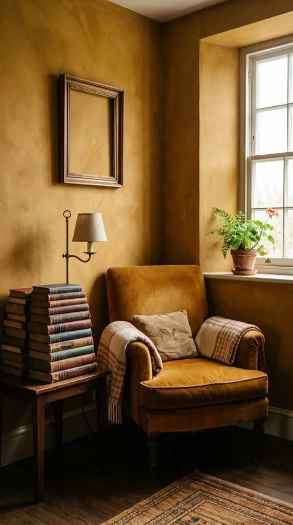
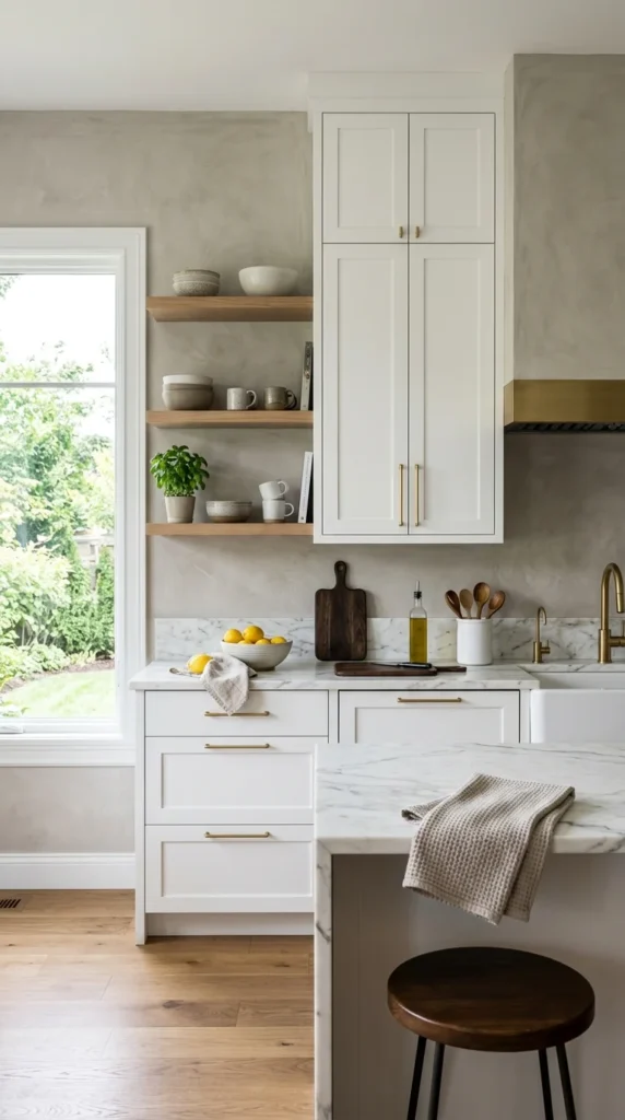
1. Earthy Neutrals
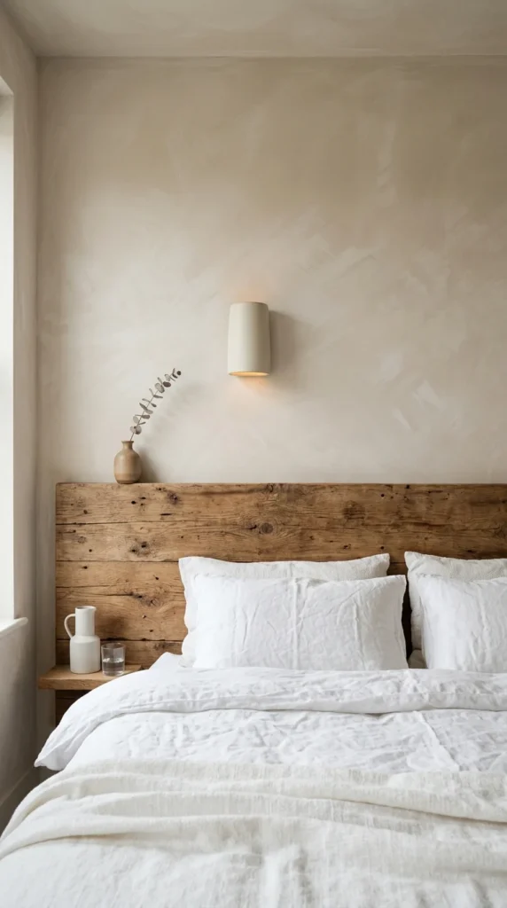
Earthy neutrals are the cornerstone of the limewash aesthetic. Shades like oatmeal, sand, and bone create a soft, cloud-like effect that provides a neutral backdrop without the sterility of traditional white paint. This look works exceptionally well in bedrooms, where the organic texture promotes a sense of calm and groundedness.
2. Slate Gray
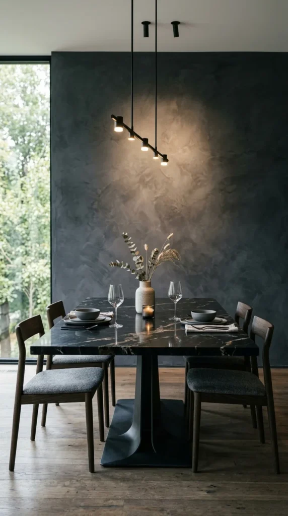
Slate gray offers a sophisticated, moody atmosphere that feels both industrial and organic. The natural variations in limewash prevent dark grays from feeling flat or heavy. Instead, the “bloom” of the lime creates a velvet-like appearance that adds immense architectural interest to a dining room or study.
3. Moody Indigo
For those who crave drama, indigo limewash provides a deep, saturated hue that maintains a soft, matte finish. The way the blue pigments settle into the lime creates a prehistoric, stone-like quality. It is an excellent choice for accent walls or smaller rooms where you want to create a “cocoon” effect.
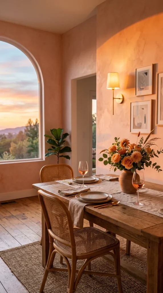
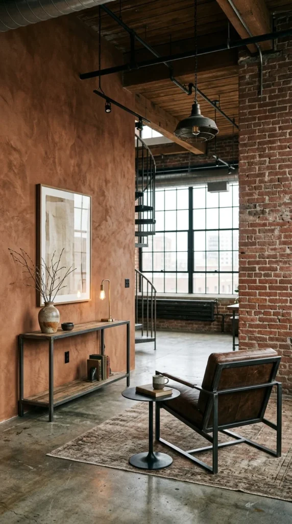
4. Terracotta Warmth
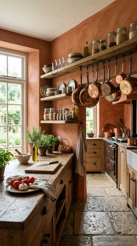
Terracotta limewash evokes the sun-baked villas of Tuscany and Morocco. This warm, clay-inspired palette brings an instant sense of heat and history to a space. It pairs beautifully with natural materials like copper, unlacquered brass, and tumbled stone.
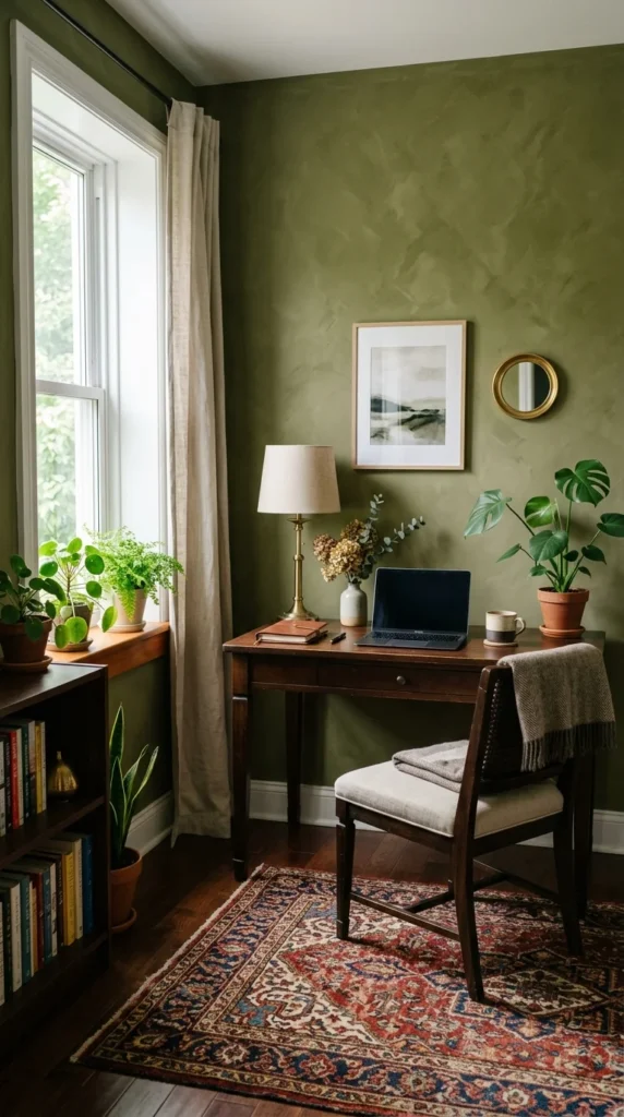
5. Sage Sanctuary
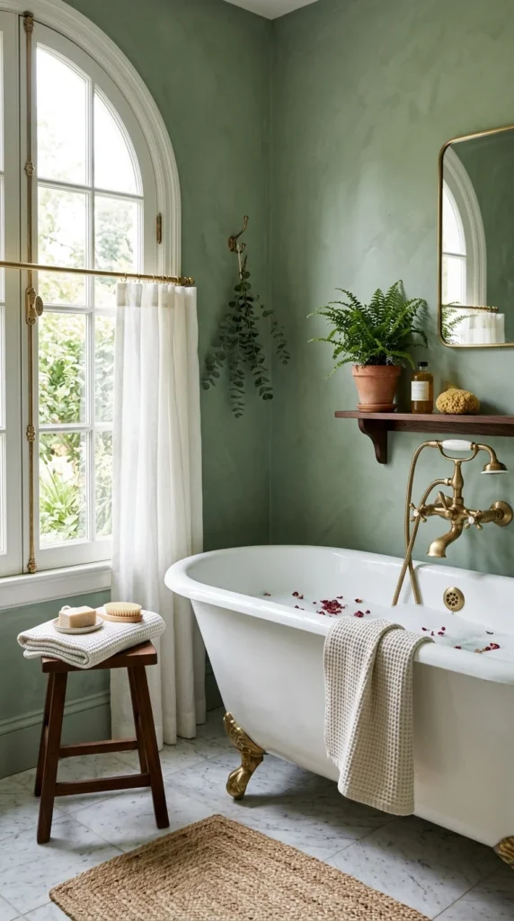
Sage green is a perennial favorite for its connection to the natural world. When applied as a limewash, the green takes on a dusty, muted quality that feels like an antique garden wall. It is particularly effective in bathrooms, where it creates a spa-like, restorative environment.
6. Creamy Minimalism
If you love the “Quiet Luxury” aesthetic, creamy minimalism is the way to go. By using a very light cream or off-white limewash, you add just enough texture to prevent the room from looking unfinished, while maintaining a bright, airy, and expansive feel.
7. Charcoal Depth
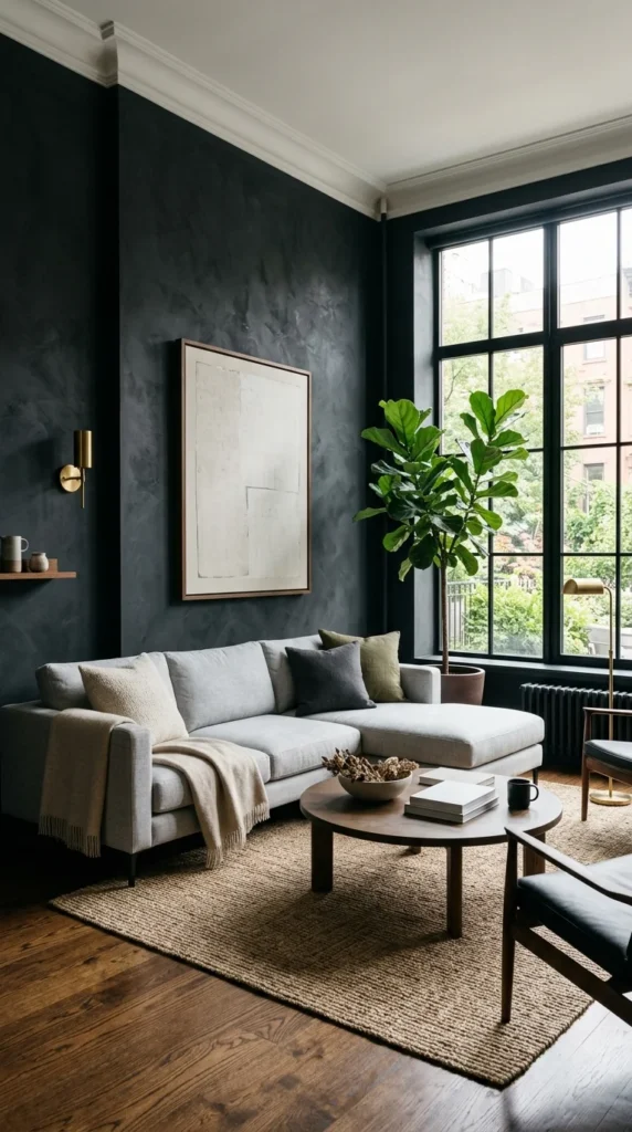
Charcoal limewash is the height of modern sophistication. Because limewash is applied in layers with a brush, charcoal walls display a stunning “clouding” effect where lighter patches of lime peek through the dark pigment, resembling a stormy sky or aged concrete.
8. Blush Softness
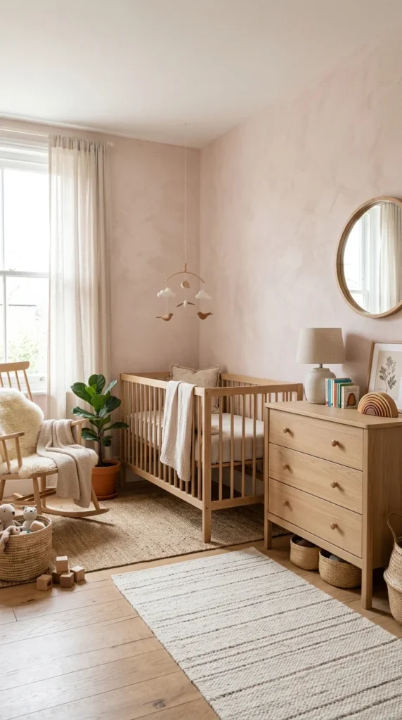
Move away from “bubblegum” pinks and toward the sophisticated hues of dried plaster and rose quartz. Blush limewash provides a sophisticated, adult take on pink that feels romantic and vintage rather than juvenile. It adds a healthy, warm glow to the complexion of anyone in the room.
9. Ochre Accents
Ochre brings the vibration of sunlight into a room. This golden-yellow hue, when applied with the characteristic cross-hatch brushstrokes of limewash, creates a vibrant, energetic space that feels historically grounded. It is perfect for North-facing rooms that lack natural light.
10. Deep Forest
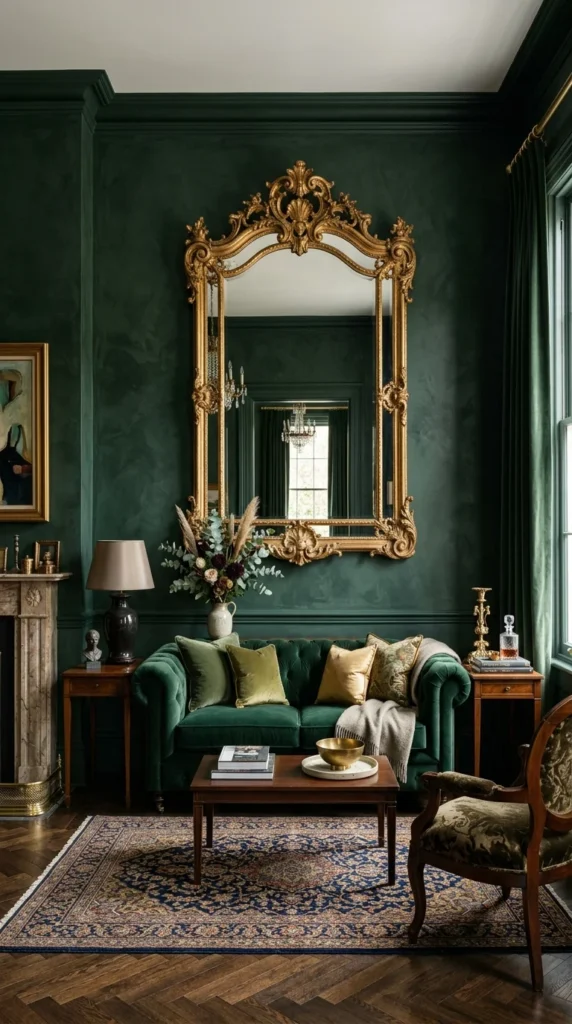
Deep forest green limewash creates a sense of luxury and mystery. The organic nature of the lime finish prevents the dark green from looking too “preppy,” giving it an aged, manor-house quality that looks stunning under the warm glow of evening lamps.
11. Sandy Beige
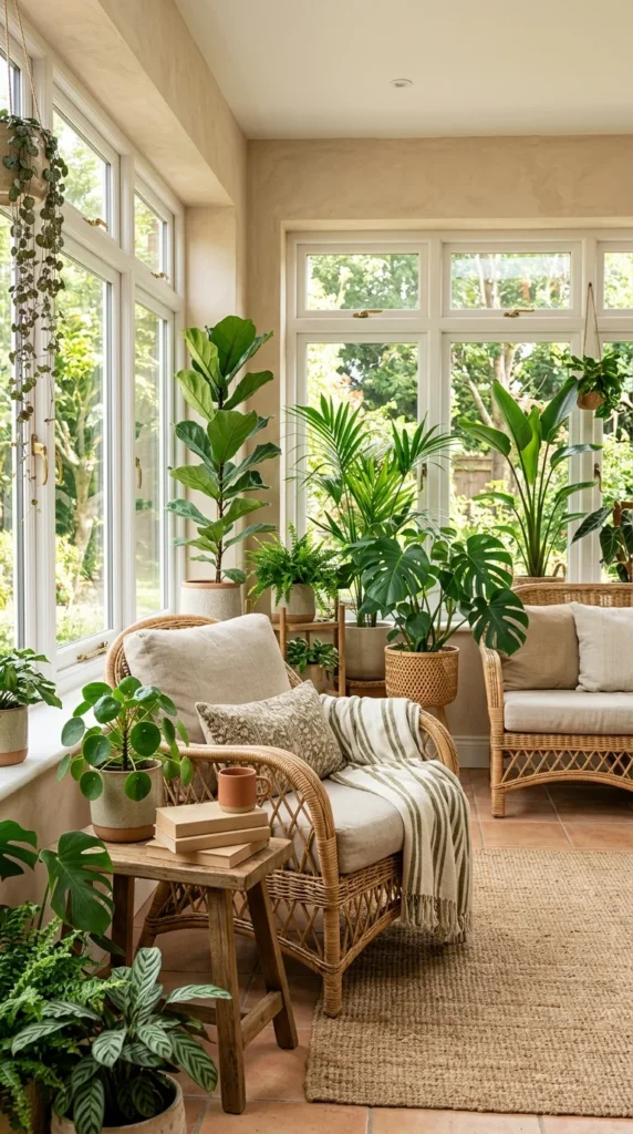
Sandy beige is the ultimate “coastal grandmother” or “Mediterranean” shade. It is lighter than terracotta but warmer than standard beige. It works perfectly with natural fibers like jute, sisal, and linen, creating a relaxed, vacation-like atmosphere.
12. Lavender Haze
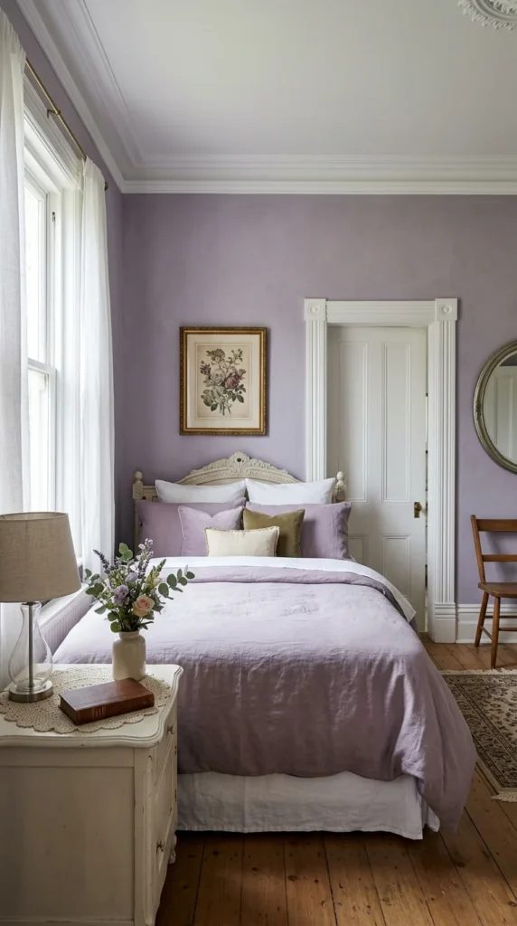
Lavender limewash is a daring but rewarding choice. By choosing a desaturated, grayish-purple, you achieve a “Provencal” look that is timeless. The matte, chalky finish of the limewash keeps the purple from feeling overwhelming or overly sweet.
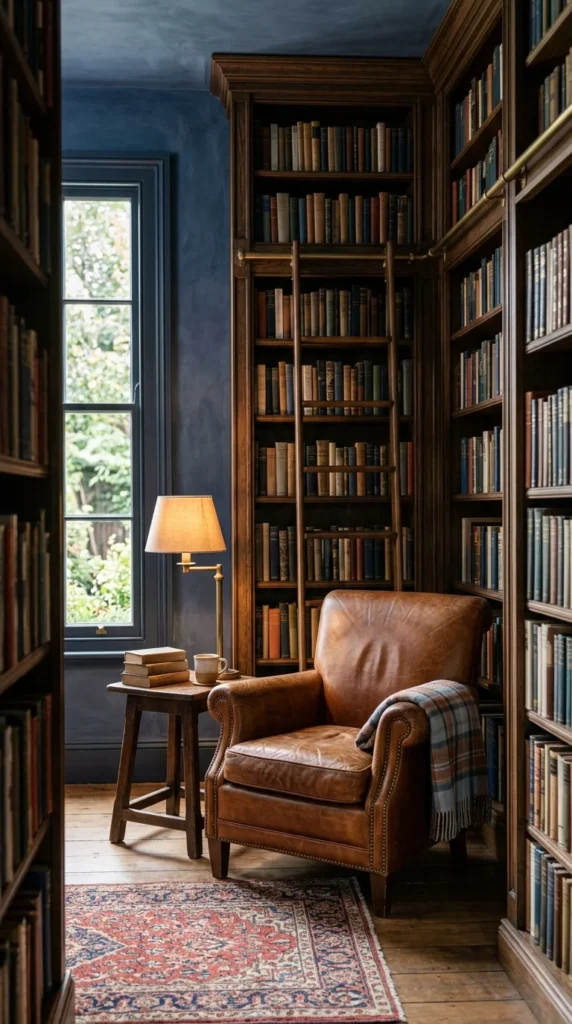
13. Olive Sophistication
Olive green is a designer favorite for its ability to act as a “near-neutral.” In a limewash finish, olive takes on a mossy, earthy texture that brings the outdoors in. It is a brilliant choice for an office or library where focus and calm are required.
14. Peachy Glow
A soft peach limewash can make a room feel like it is perpetually bathed in the “golden hour.” This hue is incredibly flattering and creates a welcoming, convivial atmosphere in dining rooms or entryways.
15. Stone Texture
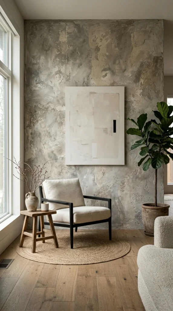
For a truly architectural look, you can layer different shades of gray and beige limewash to mimic the appearance of raw stone. This “faux-stone” technique adds incredible weight and permanence to a modern home, making new walls feel like they have stood for centuries.
16. Midnight Blue
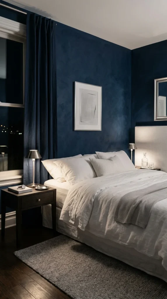
Midnight blue limewash is deeply evocative. Because the lime reacts with the air, the darkest blues often develop a slight white “bloom,” which can look like the Milky Way or a distant nebula. It is a poetic choice for a primary suite.
17. Rust Patina
Rust or burnt orange limewash offers an industrial-meets-organic vibe. It mimics the look of oxidized metal or aged clay, making it a perfect match for lofts, creative studios, or spaces with high ceilings and exposed structural elements.
18. Pale Sky
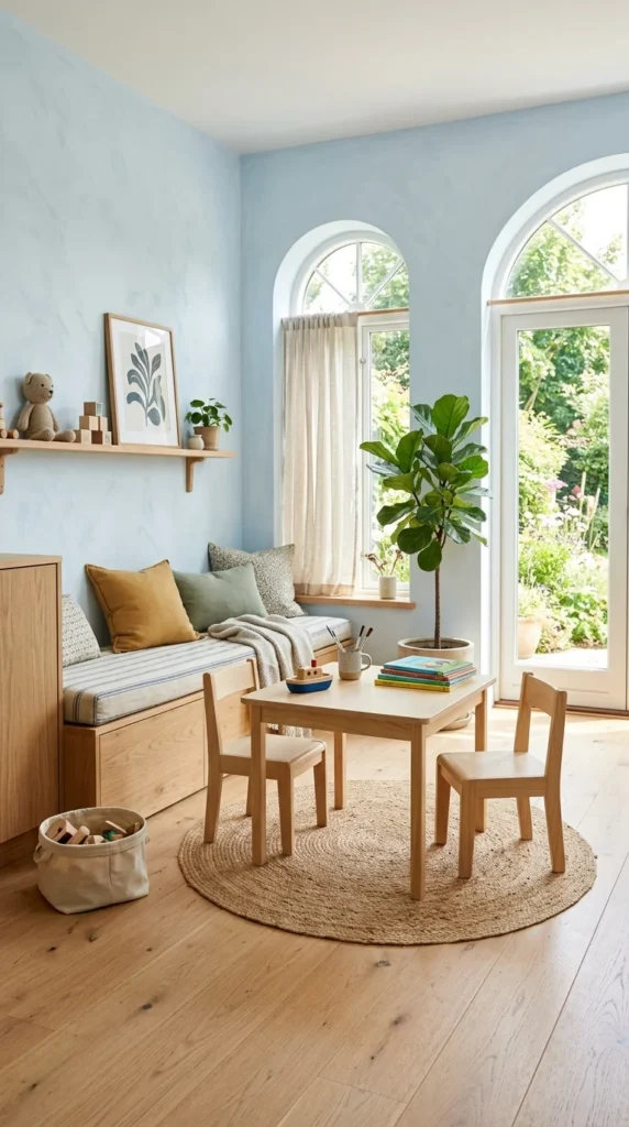
Pale sky blue limewash is the antidote to stress. It is an airy, ethereal choice that works beautifully on both walls and ceilings. When applied to a ceiling, it creates the illusion of an open sky, a classic “Haint Blue” technique updated with modern texture.
19. Taupe Elegance
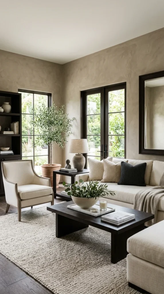
Taupe is the perfect bridge between gray and brown. Limewashed taupe walls offer a “mushy,” complex color that changes significantly depending on the time of day. It is the height of understated designer elegance.
20. Golden Hour
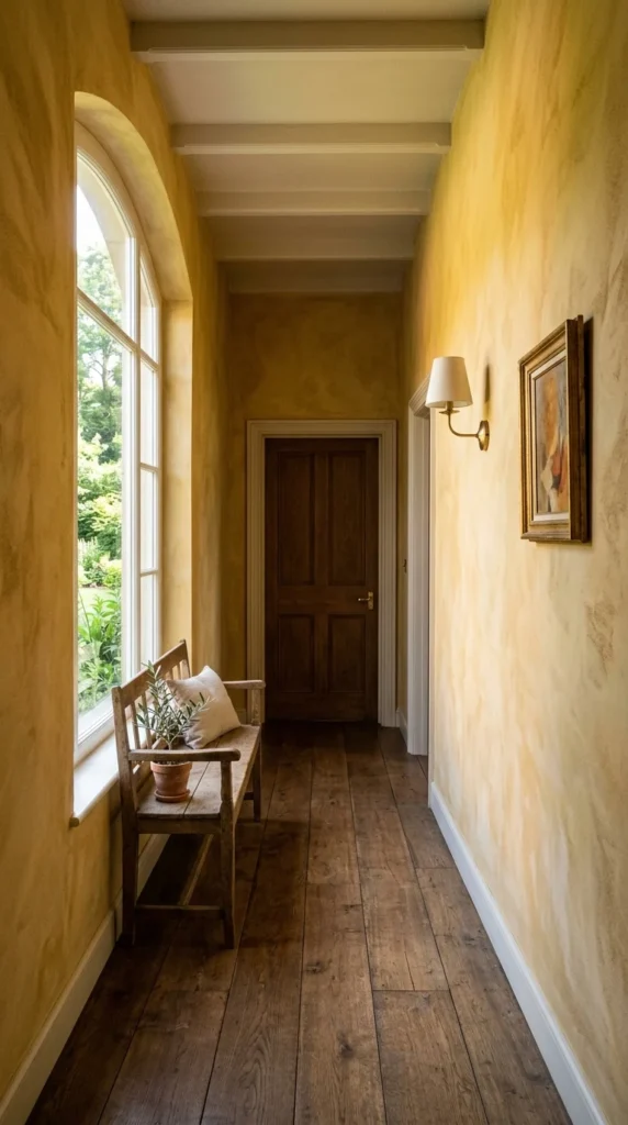
A more saturated version of ochre, “Golden Hour” limewash is bold and cheerful. It works best in transitional spaces like hallways or mudrooms, where its vibrant energy can be appreciated as you move from one room to another.
21. Greige Versatility
Greige (a mix of gray and beige) remains the most popular color in interior design for a reason. In a limewash finish, greige loses its “builder-grade” reputation and becomes a high-end, textured surface that balances warmth and coolness perfectly.
Why Choose Limewash?
Beyond the stunning visual ideas listed above, limewash offers several functional benefits that make it a superior choice for the conscious homeowner:
- Breathability: Limewash is highly permeable, allowing moisture to escape from the walls. This makes it an excellent choice for historic homes or damp climates, as it helps prevent mold and mildew.
- Eco-Friendly: Traditional limewash is made from natural minerals and pigments. It contains no VOCs (Volatile Organic Compounds) and is naturally high in pH, making it hypoallergenic and antibacterial.
- The “Patina” Effect: Unlike standard paint which peels or chips, limewash ages gracefully. It continues to calcify over time, becoming harder and more durable, while its color softens and develops a beautiful patina.
How to Achieve the Look
To achieve the “Designer Look,” the application is key. Limewash should be applied with a large, masonry brush using “X” or “cross-hatch” strokes.
- Preparation: If you are applying limewash over existing latex paint, you must use a dedicated mineral primer to ensure the limewash adheres correctly.
- Dampening: Often, walls are slightly dampened with water before application to allow the lime to spread evenly.
- Thin Layers: It is better to apply two or three thin coats than one thick one. The color will look much darker when wet and will lighten significantly as it dries (often by up to 50%).
- Movement: The amount of “movement” or mottling in the finish is determined by your brushstrokes. For a subtle look, keep strokes long and consistent. For a high-contrast, cloudy look, use shorter, more erratic strokes.
By choosing limewash, you are not just painting a room; you are adding a layer of living history to your home. Whether you opt for a soft neutral or a moody charcoal, the result is a space that feels curated, timeless, and deeply personal.