The hallway is often the most overlooked space in a home, relegated to a purely functional transition zone. However, interior designers view these narrow corridors as prime real estate for storytelling and visual impact. A well-executed gallery wall can transform a cramped passage into a breathtaking journey, adding depth, personality, and a sense of architectural intent.
By curating your hallway with the same precision as a professional gallery, you can elevate the entire aesthetic of your home. Whether you prefer the rigid structure of a grid or the organized chaos of an eclectic mix, these eleven designer-approved strategies will help you turn your hallway into a masterpiece.
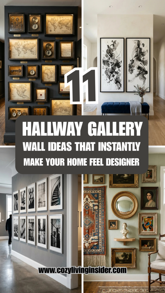
1. Uniform Grids
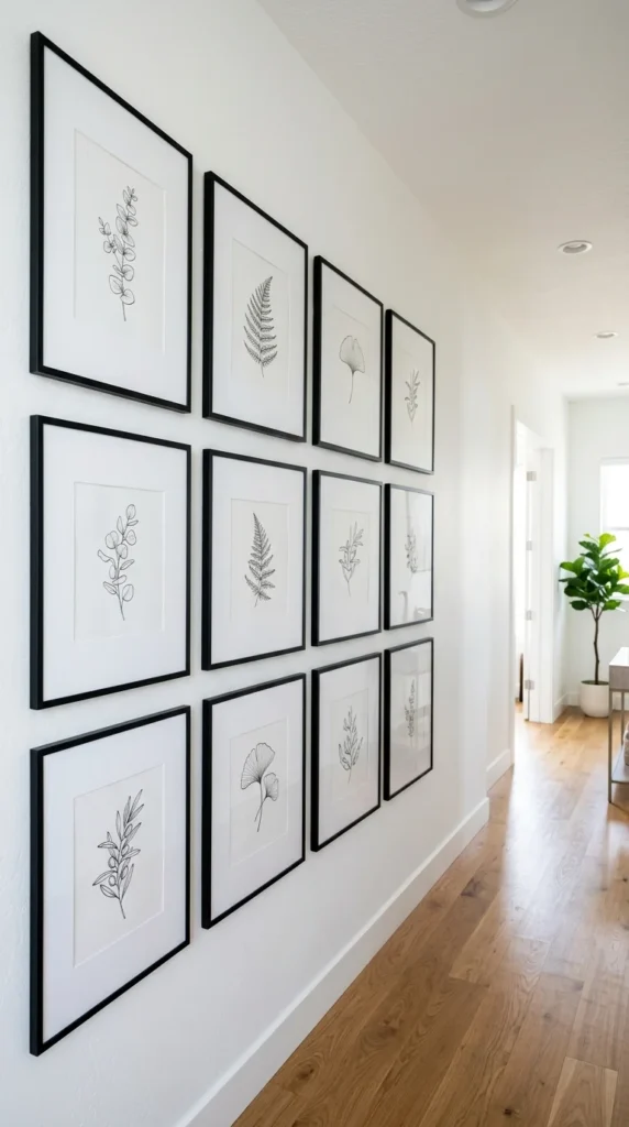
The uniform grid is the hallmark of modern, high-end design. This approach utilizes identical frames, consistent matting, and a repeating theme—such as botanical prints, architectural sketches, or black-and-white photography—to create a sense of order and rhythm.
To achieve this look, precision is paramount. Designers often use a “spacer” tool to ensure that the distance between every frame is exactly the same (usually two to three inches). This style works exceptionally well in long hallways because the repetition draws the eye forward, making the space feel more intentional and expansive. The wide matting within the frames provides “breathing room,” which prevents the collection from feeling cluttered even in a tight space.
2. Floor-to-Ceiling
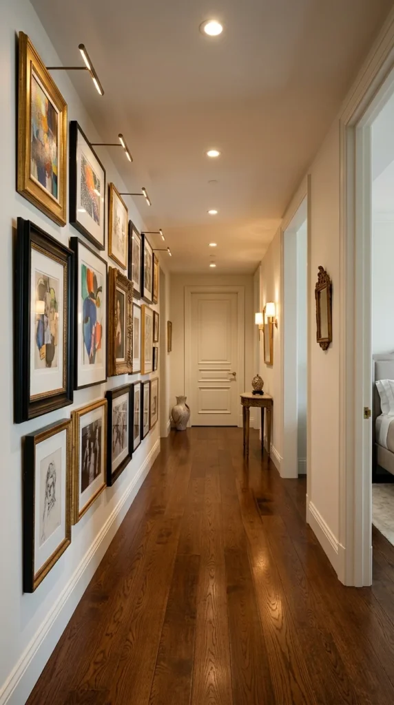
For a truly dramatic, “maximalist” designer feel, a floor-to-ceiling gallery wall is unbeatable. This technique involves filling the vertical plane of the wall almost entirely, starting just above the baseboard and reaching toward the ceiling.
This method is particularly effective for making a small hallway feel larger and more important. By breaking the standard “eye level” rule, you trick the brain into perceiving the walls as taller than they actually are. When executing this, it is helpful to start with your largest pieces in the center and work outward, filling the gaps with smaller frames, wall sculptures, or even decorative brackets. The key to making this feel designer-level rather than cluttered is maintaining a consistent color palette or a unified theme across the diverse pieces.
3. Mixed Media
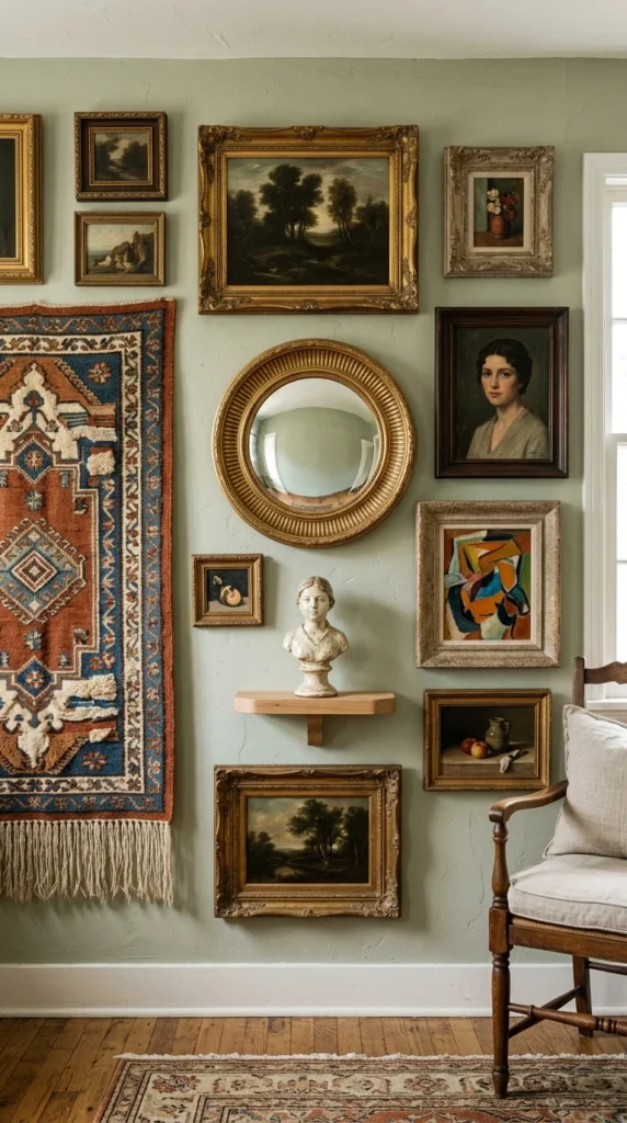
Designer homes often feature layers of texture that go beyond flat paper behind glass. A mixed media gallery wall incorporates three-dimensional objects to create visual intrigue and depth. This might include antique mirrors, wall-mounted sculptures, vintage keys in shadow boxes, or even textile art like small tapestries.
Mixing media breaks the monotony of rectangular frames. A round mirror, for instance, can soften the hard lines of a hallway and reflect light into darker corners. When planning a mixed media wall, treat the objects as “anchors” and arrange your framed art around them. This creates a curated, “collected over time” look that feels authentic and high-end.
4. Black and White
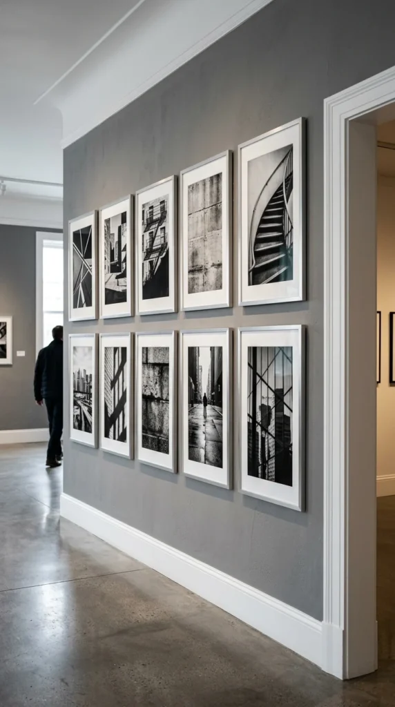
There is an inherent sophistication in a monochromatic palette. A black-and-white gallery wall is a timeless choice that fits perfectly into contemporary or transitional homes. By removing color, you force the viewer to focus on composition, contrast, and subject matter.
Designers often use this strategy to unify a disparate collection of images. You can take family photos from different eras, travel snapshots, and professional prints, and by simply converting them all to black and white and using matching frames, you create a cohesive narrative. This approach feels particularly “designer” when paired with museum-style lighting, such as adjustable track heads or sleek picture lights mounted above the frames.
5. Lean and Layer
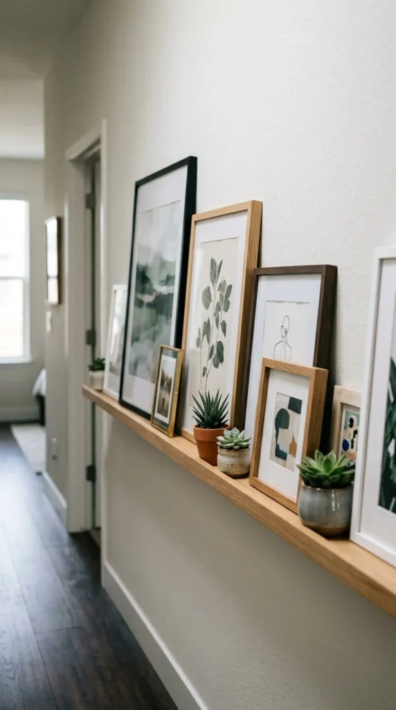
The “lean and layer” method is a favorite among stylists who want a look that is both sophisticated and effortlessly casual. Instead of hanging art directly on the wall, you install a narrow picture ledge (or use a long, low console table) and lean the frames against the wall.
This technique allows for incredible flexibility; you can swap out pieces or rearrange the composition without ever picking up a drill. Overlapping the frames adds a sense of depth and dimension that flat hanging cannot achieve. To keep it looking professional, ensure you have a mix of heights—tall vertical pieces should be balanced by smaller horizontal ones—and include a few non-art items like a small vase or a sculptural object to break up the lines.
6. Symmetrical Pairs
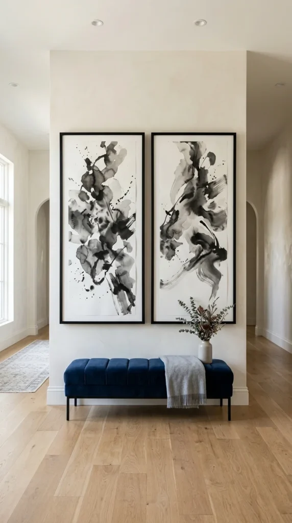
Sometimes, less is more. In a wider hallway or an entryway passage, using a pair of oversized, symmetrical frames can create a powerful statement. This “diptych” approach feels very high-end and minimalist, focusing the attention on two high-quality pieces rather than a dozen smaller ones.
The secret to this look is scale. The frames should be large enough to command the space, often taking up a significant portion of the wall’s height. This creates a focal point that anchors the hallway, making it feel like a destination rather than just a path. Choose art that is either identical or part of a matched set to maintain the balance that defines this style.
7. Colorful Eclecticism
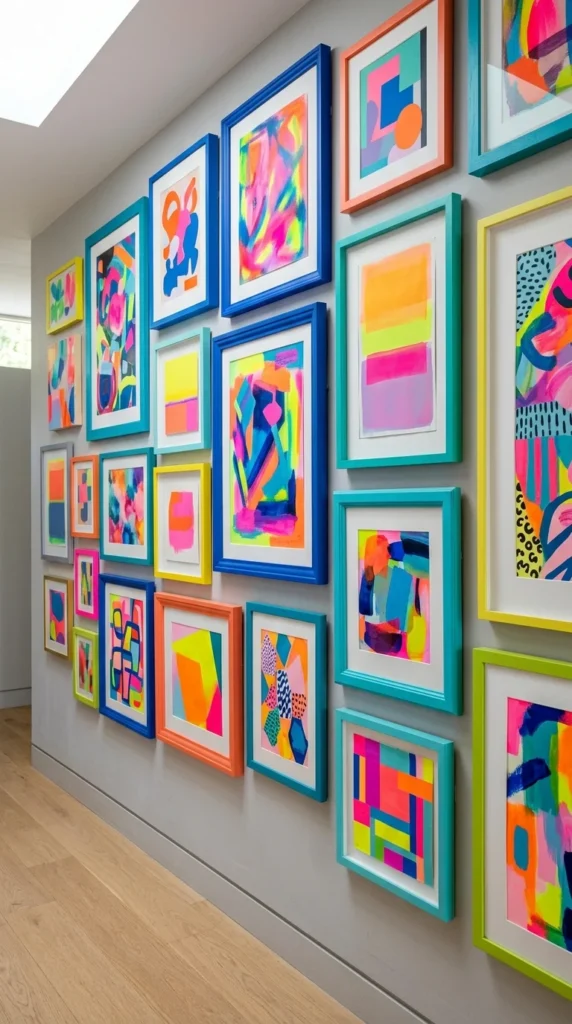
If your home leans toward a maximalist or bohemian aesthetic, a colorful eclectic gallery wall can be a stunning way to inject energy into a hallway. Unlike the rigid grid, this style thrives on variety. You can mix vintage gold leaf frames with modern neon acrylic ones, and oil portraits with graphic posters.
The designer “trick” to making an eclectic wall look cohesive is to find one common thread. This could be a recurring color (e.g., every piece has a touch of yellow), a consistent frame style in different sizes, or a similar art medium. This ensures that while the wall is busy and vibrant, it still feels like a single, unified installation.
8. Minimalist Linear
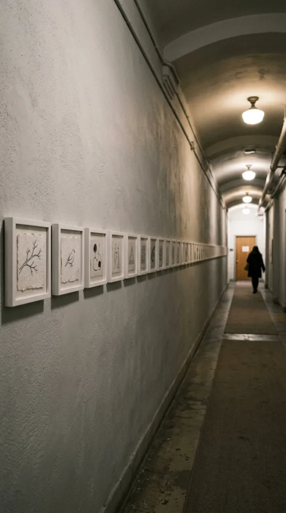
The minimalist linear arrangement is perfect for long, narrow hallways where you want to emphasize the architectural length of the space. By hanging a single row of frames at eye level, you create a visual “horizon line” that guides the viewer through the home.
This style works best with smaller artworks and generous spacing. The negative space (the empty wall) is just as important as the art itself in this configuration. It communicates a sense of calm and restraint. To make it feel truly designer, use high-quality frames with shadow-box depths or floating mounts, which add a subtle three-dimensional quality to the simple arrangement.
9. Wraparound Corner
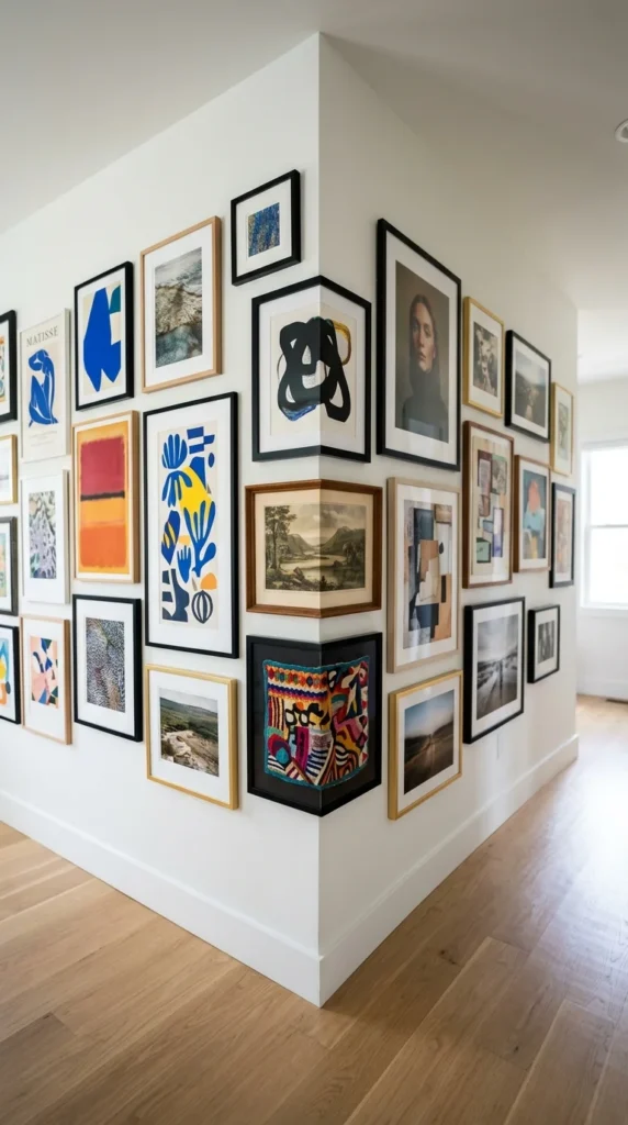
A wraparound gallery wall is a clever way to deal with the awkward corners and turns found in many hallways. Instead of treating each wall as a separate entity, you treat the corner as a hinge, allowing the art to flow from one surface to the next.
This technique is visually intriguing because it encourages the viewer to literally “follow the art” around the bend. It makes the hallway feel like an immersive environment rather than a series of flat surfaces. When planning a wraparound, place a frame very close to the corner on both sides to lead the eye around the edge, maintaining a consistent hanging height to ensure the transition feels seamless.
10. Personal Artifacts
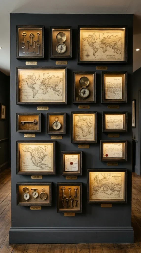
A gallery wall is the perfect place to showcase more than just prints; it is an opportunity to display personal history in a way that feels like a curated museum exhibit. By using shadow boxes and custom framing, you can elevate everyday objects—travel mementos, heirloom jewelry, or vintage documents—into works of art.
Designers often use this approach to give a home “soul.” The key to making personal artifacts look professional is the framing. Using archival-quality mats and high-end frames ensures that your treasures are protected and presented with the respect they deserve. Mixing these 3D shadow boxes with traditional flat-framed photos creates a rich, narrative-driven wall that guests will want to stop and study.
11. Oversized Statements
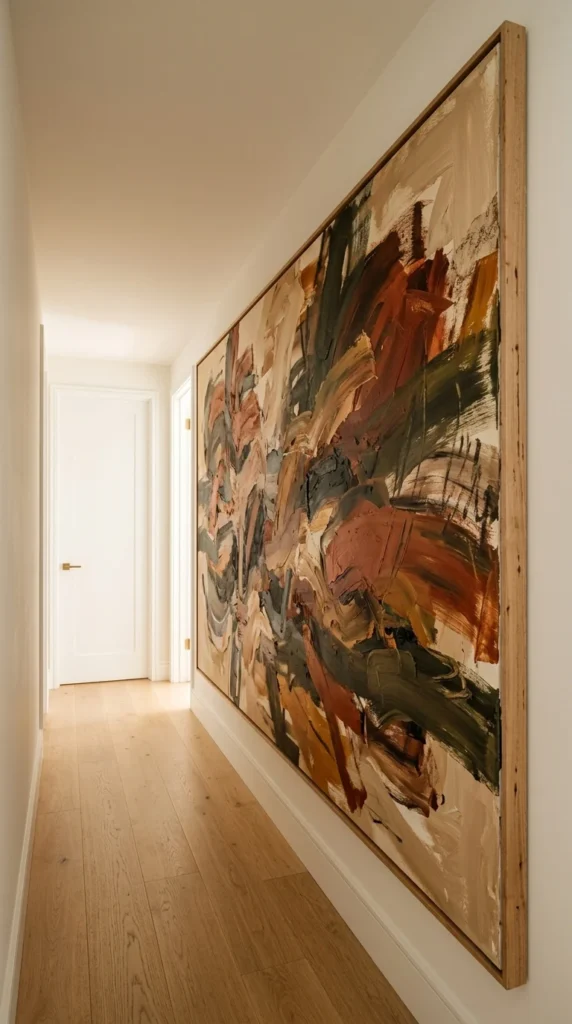
Sometimes, the most “designer” move you can make is to reject the idea of a “gallery” of small items in favor of one or two massive statement pieces. An oversized artwork in a hallway creates an immediate “wow” factor, transforming the wall into a dedicated gallery space.
This works particularly well at the end of a hallway—the “terminal vista.” As you walk down the corridor, the large-scale art serves as the destination. Ensure the piece is properly lit with a dedicated picture light or recessed ceiling spotlight. By choosing one significant piece, you simplify the visual field, which can make a cluttered home feel more organized and luxurious.
Pro-Tips for a Designer-Level Installation
To ensure your hallway gallery wall looks like it was installed by a professional, keep these final tips in mind:
- Plan on the Floor: Before driving a single nail into the wall, lay your entire arrangement out on the floor. This allows you to move pieces around, check the spacing, and see how the colors interact without damaging your walls.
- The 57-Inch Rule: Designers typically hang art so that the center point of the piece (or the center of the gallery grouping) is 57 to 60 inches from the floor. This is standard museum height and represents the average human eye level.
- Lighting is Everything: Even the best art will look flat in a dark hallway. Use adjustable LED recessed lights or stylish wall-mounted picture lights to highlight your collection.
- Consistency in Spacing: Whether you choose a two-inch gap or a five-inch gap, stay consistent. Use a level and a measuring tape; the human eye is remarkably good at spotting even a slightly crooked frame or an uneven gap.