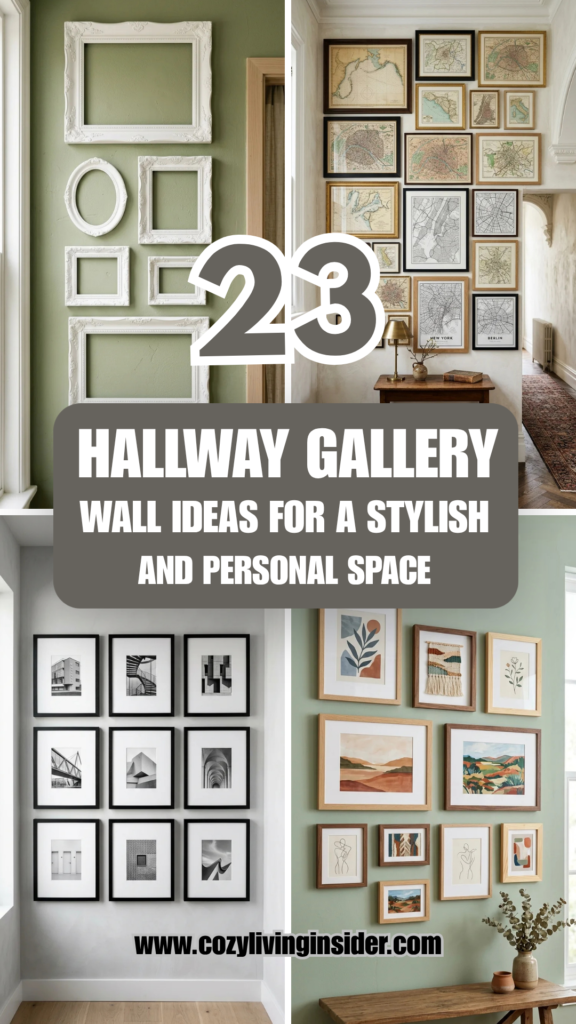
The hallway is often the most overlooked area of the home, frequently relegated to a mere transitional passage. However, these narrow corridors offer some of the best real estate for personal expression. A gallery wall transforms a mundane walk from the bedroom to the kitchen into a curated journey through your history, tastes, and artistic preferences. Whether you prefer the rigid structure of a grid or the organized chaos of an eclectic mix, a well-executed gallery wall adds depth, character, and a sense of “home” to your interior design.
1. Uniform Grids
A uniform grid is the hallmark of modern sophistication. By using identical frames and consistent spacing, you create a sense of order and calm. This approach works exceptionally well with themed photography, such as botanical sketches, architectural details, or a series of family portraits taken in the same lighting. The key to success here is precision; use a level and measuring tape to ensure every gap is exactly the same width.
2. Floor-to-Ceiling
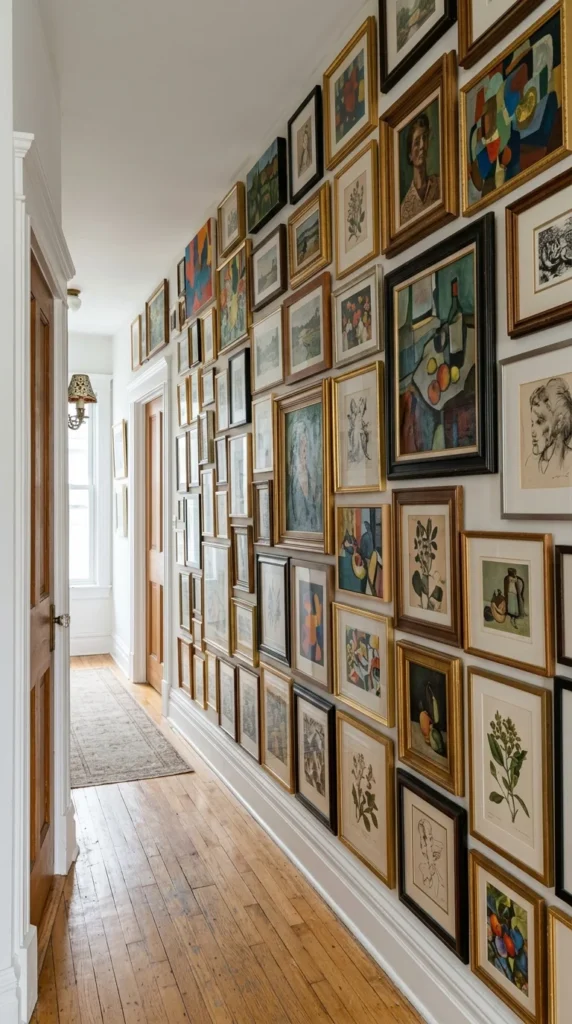
For those who want to make a maximalist statement, a floor-to-ceiling gallery wall is the ultimate choice. This technique removes the “dead space” above and below the eye line, effectively turning the wall into a mural of framed memories. To prevent the space from feeling claustrophobic, use a mix of frame thicknesses and ensure there is a common thread—like a consistent color palette—running through the pieces.
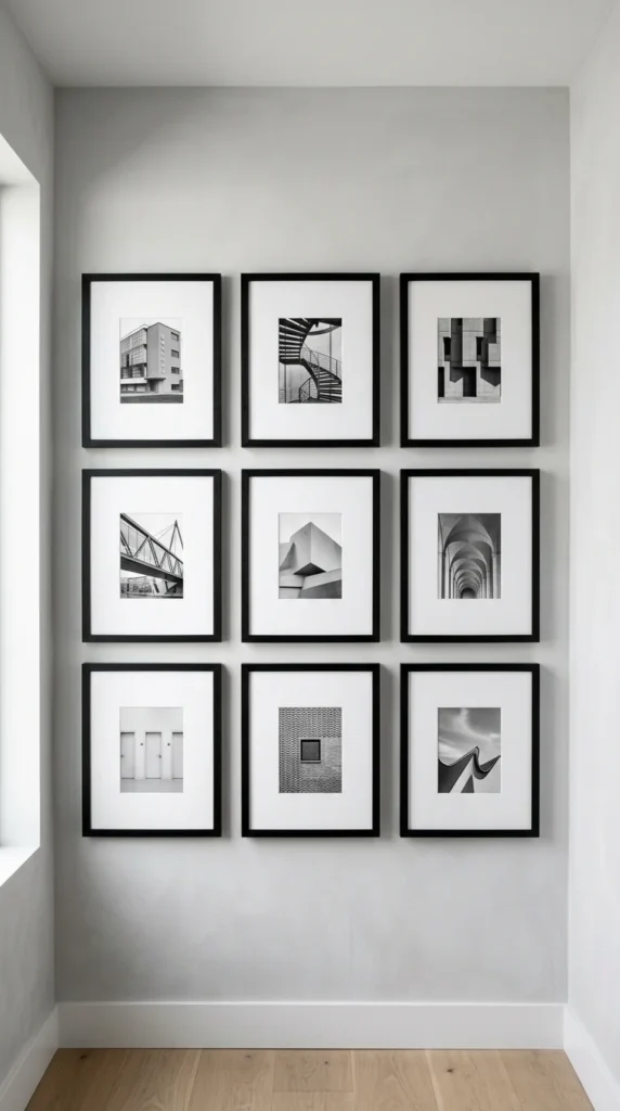
3. Black and White
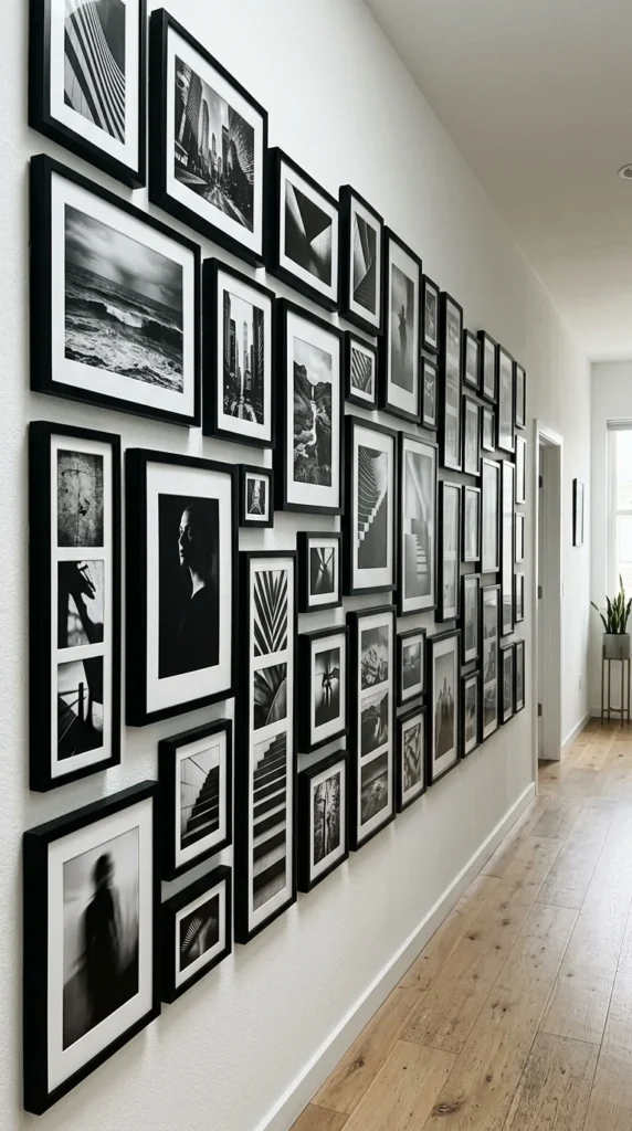
There is an enduring elegance to black and white photography. Removing color simplifies the visual field, allowing the viewer to focus on texture, composition, and emotion. This style is incredibly forgiving for beginners because the lack of color automatically creates a cohesive look, even if the subjects of the photos are wildly different.
4. Mixed Media
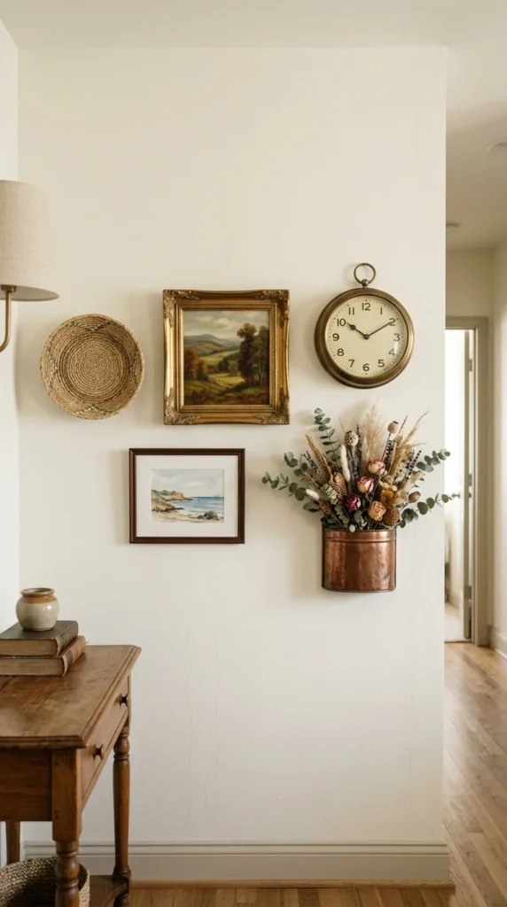
A gallery wall doesn’t have to be limited to paper and canvas. Integrating 3D objects adds texture and intrigue. Consider mixing in small mirrors, decorative plates, antique keys, or sculptural elements. This adds a tactile quality to the hallway and breaks up the flat planes of the frames.
5. Lean and Layer
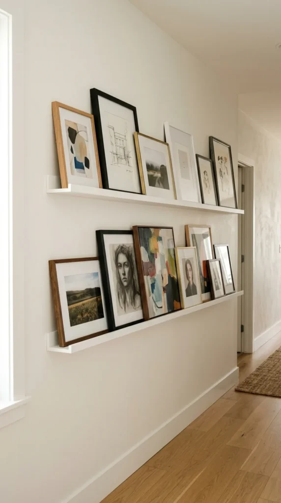
If you are someone who likes to change their decor frequently, picture ledges are the perfect solution. Instead of hammering dozens of holes into your wall, you simply lean the frames against the ledge. This allows you to layer smaller frames in front of larger ones, creating depth and a casual, studio-like vibe.
6. Corner Wrap
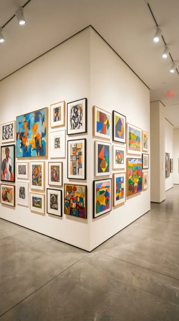
Don’t let a corner stop your creativity. Wrapping a gallery wall around a turn creates a sense of continuity and leads the eye deeper into the home. This is an excellent way to connect two different areas of the house visually while making use of an often-wasted architectural feature.
7. Oversized Art
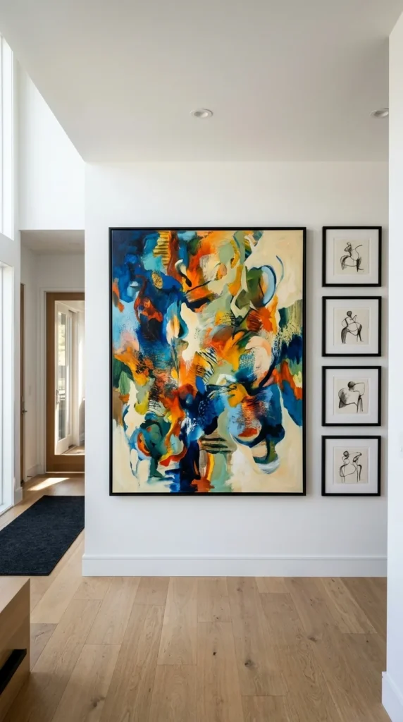
Sometimes, one large piece is more impactful than ten small ones. By centering an oversized statement piece and surrounding it with a few smaller “accent” frames, you create a clear focal point. This prevents a long hallway from looking cluttered while still maintaining the gallery aesthetic.
8. Natural Wood
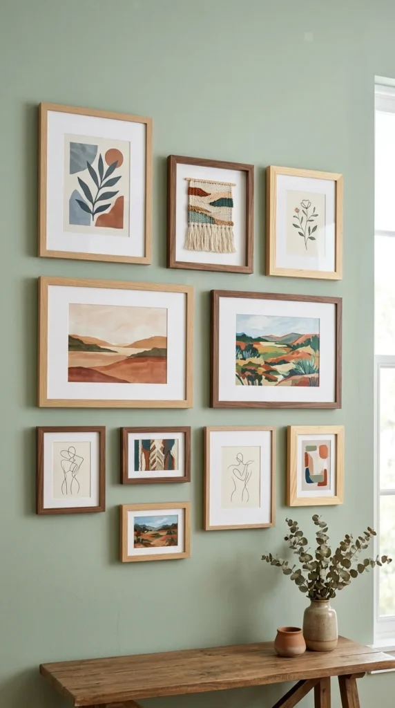
Using natural wood frames brings warmth and an organic feel to a hallway. This is particularly effective in homes with Scandinavian or Mid-Century Modern influences. Mixing different wood tones can add a curated, “collected over time” look, whereas using a single wood species provides a more polished and intentional finish.
9. Mismatched Frames
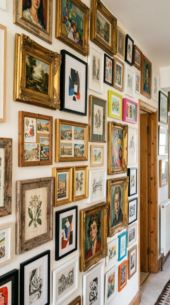
The “mismatched” look is perfect for bohemian or traditional homes. It allows you to scavenge for frames at thrift stores and antique markets. The secret to making this look intentional rather than messy is to maintain a consistent spacing between the frames, which acts as the “glue” holding the diverse elements together.
10. Kids’ Art
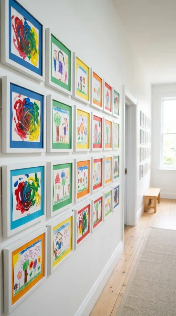
Hallways are the perfect venue for a “rotating gallery” of your children’s masterpieces. Using professional frames for kids’ art elevates the work and makes children feel their creativity is valued. It also adds a joyful, vibrant energy to the transitional spaces of your home.
11. Botanical Prints
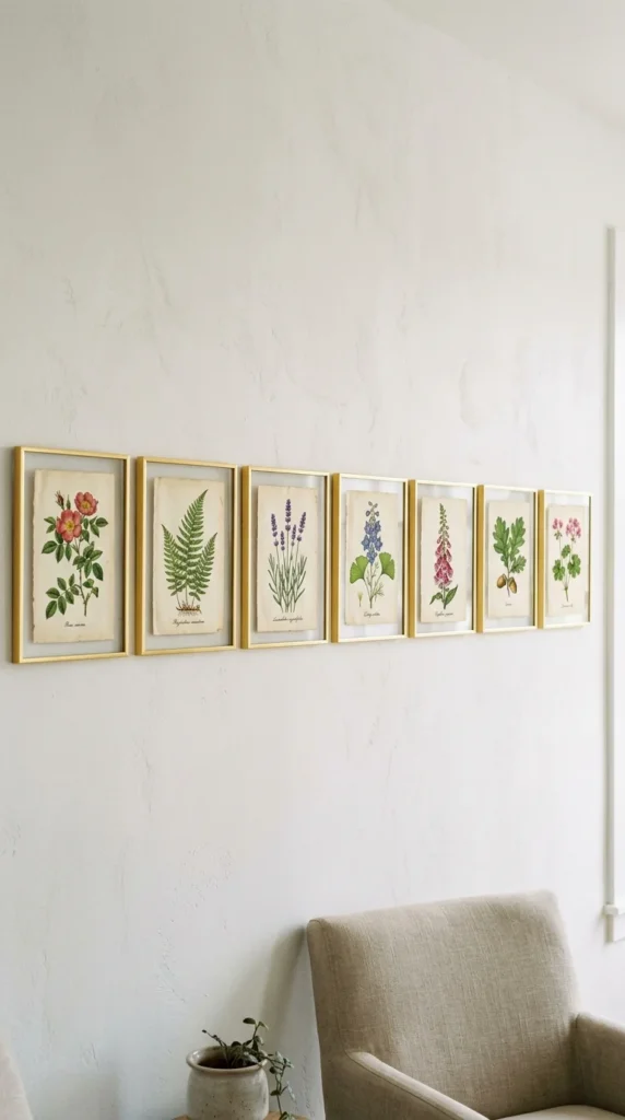
Botanical prints are timeless and calming. Whether you use vintage scientific illustrations or modern macro photography of plants, this theme brings a touch of nature indoors. It’s a great way to “soften” a hallway that might otherwise feel cold or clinical.
12. Mirror Accents
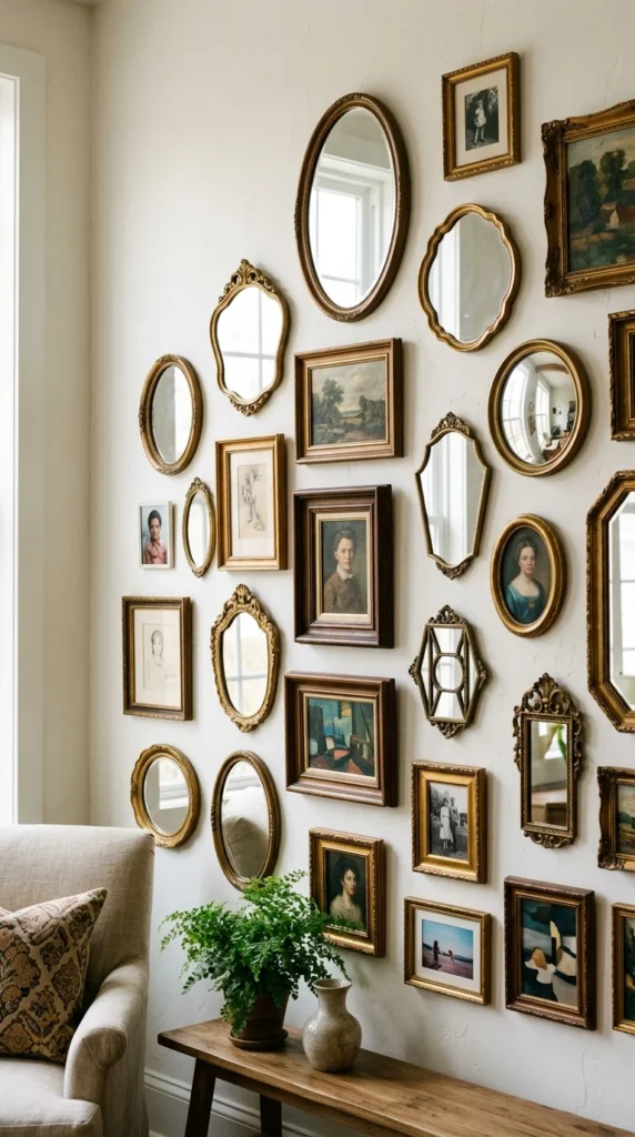
In narrow hallways, mirrors are a functional necessity that can be integrated into your art display. They reflect light, making the space feel wider and brighter. Choosing mirrors with interesting frames—like sunbursts or ornate baroque styles—allows them to blend seamlessly with your artwork.
13. Neon Accents
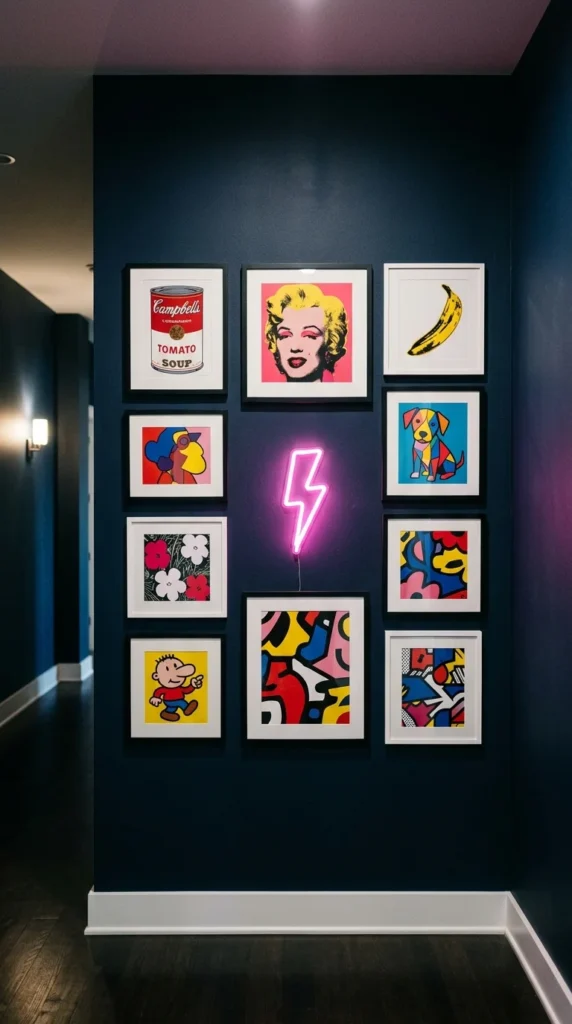
For a contemporary and edgy look, incorporate a small neon light or an LED art piece into your gallery. This adds a glow that functions as both art and ambient lighting. It’s an unexpected twist that works particularly well in homes with a modern or industrial aesthetic.
14. Monochrome Palette
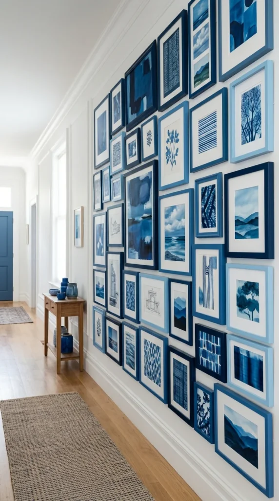
If you want a bold look that remains cohesive, try a monochromatic theme. Choose a single color and find art and frames that fit within that spectrum. This creates a high-impact visual experience that feels curated and sophisticated.
15. Map Collection
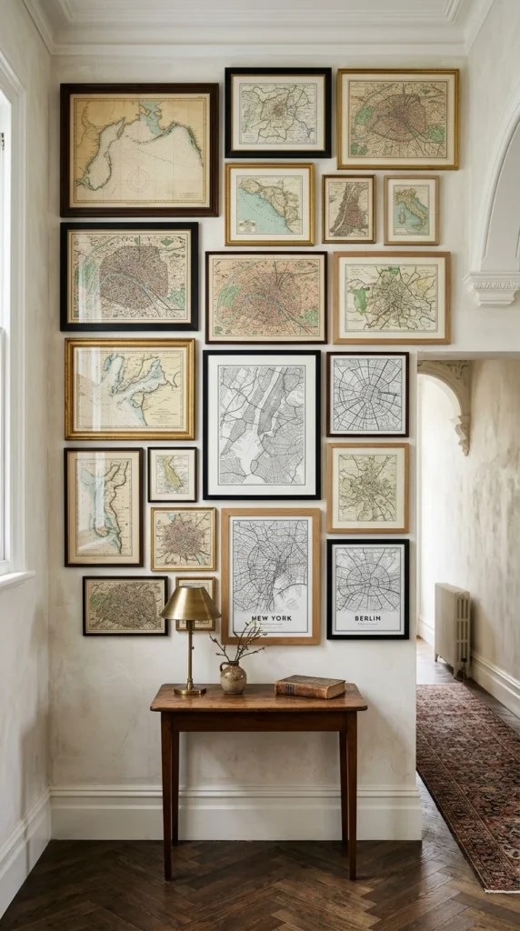
Maps are not only beautiful but also tell a story of your travels or your heritage. A collection of maps from different eras and locations can serve as a wonderful conversation starter. Use different scales—from a world map to a map of your neighborhood—to add variety.
16. Empty Frames
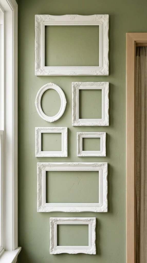
Sometimes the frame itself is the art. Using empty, decorative frames—especially when painted a single color—creates a sculptural, architectural effect. This is an excellent low-cost way to fill a large wall space while adding significant visual texture.
17. Textile Art
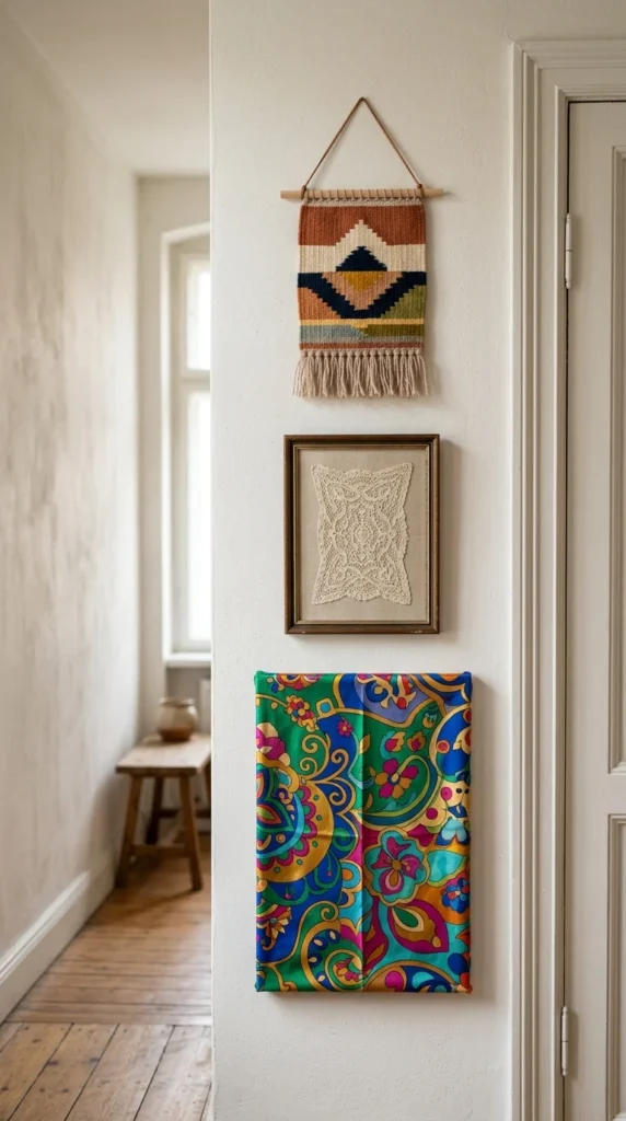
Bring softness to your hallway by including textiles. Framed fabric, small rugs, or woven wall hangings add a layer of warmth and sound dampening that traditional paper-and-glass art cannot provide. This is especially useful in hallways with hard flooring where echoes might be an issue.
18. Vertical Alignment
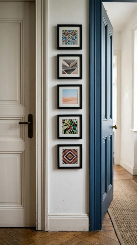
If you have a very narrow sliver of wall, don’t ignore it. A vertical gallery—where frames are stacked in a single column—draws the eye upward and makes the ceilings feel taller. This is a clever way to utilize every inch of your hallway.
19. Shadow Boxes
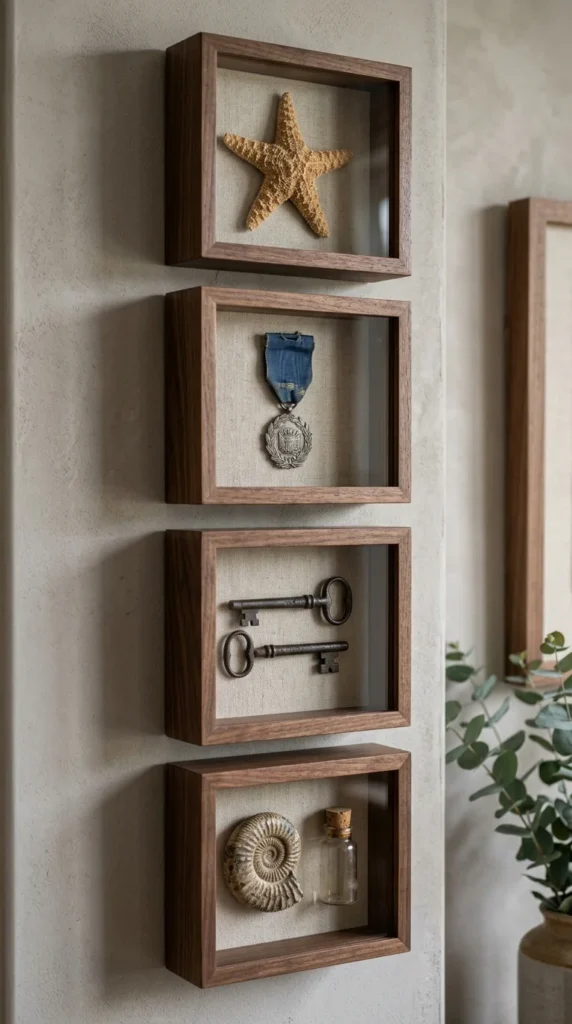
Shadow boxes allow you to display three-dimensional mementos that wouldn’t fit in a standard frame. This adds a museum-like quality to your hallway, encouraging guests to stop and look closely at the treasures within.
20. Clustered Circles
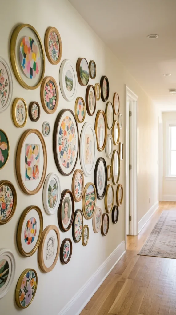
Break up the monotony of right angles by using round or oval frames. A cluster of circular frames feels more organic and fluid than a standard rectangular grid. It’s a great way to add a feminine or whimsical touch to the space.
21. Gold Gilding
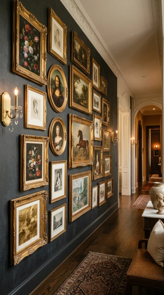
For a touch of glamor, use gold frames. Gold pops beautifully against dark, moody wall colors like navy, emerald, or charcoal. The metallic finish catches the light and adds a sense of luxury to even the simplest sketches or prints.
22. Sketchbook Style
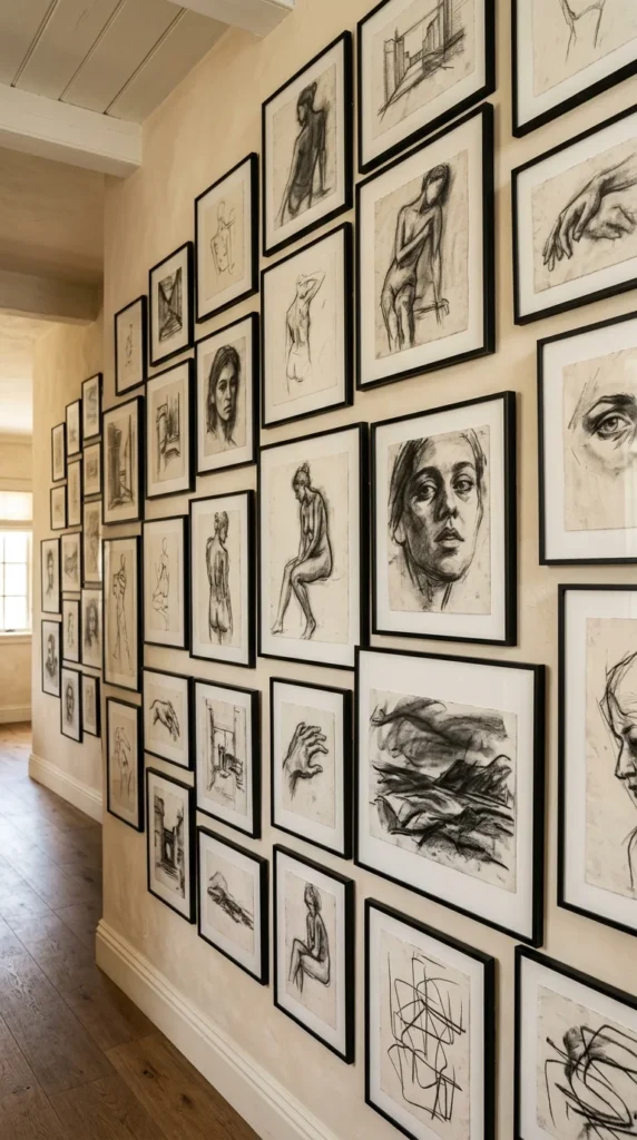
If you appreciate the “unfinished” look, a gallery of sketches and line drawings can be very impactful. The simplicity of the medium creates a sophisticated, studio-like atmosphere. This style works best with minimalist frames that don’t distract from the delicate lines of the art.
23. Lit Gallery
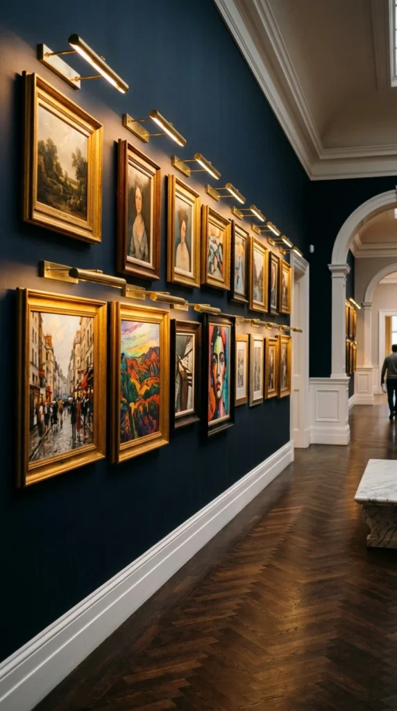
Lighting is the final touch that elevates a gallery wall from good to professional. Dedicated picture lights or adjustable track lighting ensure that your art is visible and highlighted. This also provides soft, indirect light for the hallway at night, creating a warm and inviting ambiance.
Planning Your Gallery Wall: Pro Tips
- The Paper Template Trick: Before driving any nails, cut out pieces of kraft paper in the sizes of your frames and tape them to the wall. This allows you to visualize the layout and make adjustments without damaging the plaster.
- Eye Level is Key: Generally, the center of your gallery wall (or the center of your main pieces) should be at eye level—roughly 57 to 60 inches from the floor.
- Spacing Matters: Aim for 2 to 3 inches of space between frames. Consistent spacing is the secret to making a collection of different items look like a single, unified installation.
- Think About Traffic: In a narrow hallway, ensure that your frames are securely mounted and not too deep, so they don’t get knocked over as people walk by. Using adhesive strips in the bottom corners of frames can keep them perfectly level.